It is often observed that a home can appear inexpensive, regardless of the money invested in its furnishings and decor. This perception is not typically a result of high prices but rather stems from how various design choices interact within a space. What often occurs is a series of subtle missteps that collectively diminish the perceived quality of an environment. The following discussion delves into common design mistakes that cheapen your home, offering actionable insights for transformation, building upon the valuable observations presented in the accompanying video.
Addressing Vertical Compression: The Missing Upper Half of Your Room
A significant oversight in many interior spaces involves a sole focus on horizontal dimensions, neglecting the crucial vertical plane. Individuals frequently prioritize furniture and floor space, dedicating their efforts to selecting sofas, coffee tables, chairs, and beds, which predominantly occupy the lower to middle visual layers. Consequently, the upper portions of a room, often above waist height, remain largely underutilized, leaving vast expanses of empty wall space. This singular focus creates a visually compressed effect, where the majority of the visual weight rests in the lower half, causing the eye to feel trapped and the room to appear unbalanced.
To counteract this, a strategic approach involves conceptualizing your room in three distinct layers: lower, middle, and upper. While the lower and middle layers are frequently managed adequately, the upper layer typically receives insufficient attention. Integration of elements such as artwork hung at appropriate eye levels, tall floor lamps, expansive bookcases, or stylish wall sconces can effectively draw the eye upward. Furthermore, the inclusion of pendant lights, chandeliers, thoughtfully installed curtains, hutches, or even taller plants will help occupy this often-overlooked upper third of the space. It is suggested that at least one or two elements in each room should extend into this upper zone, facilitating comfortable visual movement throughout the entire space rather than being confined to lower levels.
Overcoming the “Showroom in a Box” Effect: Avoiding Flat-Pack Overload and Matchy Sets
While many mass-market retailers offer numerous timeless pieces, an entire room furnished exclusively with flat-pack items can inadvertently project an inexpensive aesthetic. A common error involves acquiring matching furniture sets from the same product line, which can make a space feel overly coordinated and, paradoxically, less intentional. As a general guideline, it is recommended to limit purchases from the same line to no more than two pieces within a single room; exceeding this can result in an uninspired and monotonous environment. This issue extends beyond mere matching sets, encompassing the inherent characteristics of much flat-pack furniture, which often features thin panels, simple shapes, and printed finishes, frequently constructed from MDF or particle board.
To cultivate a more sophisticated home design, the introduction of contrast is paramount. Sourcing furniture from diverse retailers, second-hand markets, or specialty stores allows for the blending of different eras, materials, and silhouettes. This approach introduces pieces with greater visual weight or intricate detailing, such as a vintage solid wood side table, a sculptural lamp, or custom hardware like heavier brass or ceramic knobs. Attention to subtle details, including leg designs, hardware quality, and the presence of depth or grain, signifies craftsmanship and value. Integrating unique, well-made pieces, even if they are budget-friendly and require more time to find, helps to break the uniform “showroom” appearance and imparts a sense of considered curation.
Curating Beyond Generic Decor and Artificial Accents
The prevalence of generic and overtly artificial decor can significantly detract from a home’s authenticity and appeal. Items such as ubiquitous black and white city prints, mass-produced Mona Lisa reproductions, or decorative word art, commonly found in rental units, often lack individuality. Such decor, if it could belong to literally anyone, fails to imbue a space with a sense of personal history or significance. A useful framework for evaluating decorative items is the “beauty, function, or meaning” test; if an object does not satisfy at least one of these criteria, its display might be reconsidered.
Specifically concerning art, selecting pieces that possess personal meaning or evoke genuine enjoyment is strongly advised. This could manifest as artwork by a local artist, cherished personal photographs, or even a thoughtfully framed public domain print. Even framing a beloved album cover can inject more personality and interest than a generic retail print. Regarding plants, while their presence offers numerous benefits, clearly artificial botanical accents can diminish a room’s aesthetic. Although faux plants can be practical, selecting those with a highly natural appearance, which do not obviously betray their artificiality, is crucial. An obviously fake, large plant can inadvertently cheapen the entire interior design scheme.
Strategic Color Application: Moving Beyond the Single Pop Cushion
The perceived cheapness of many rooms does not typically stem from an absence of color, but rather from a profound lack of chromatic variation. A common scenario involves the exact same color, often in a singular shade, being repeatedly featured across cushions, artwork, and throws. The fundamental issue is not the chosen color itself, but the absence of depth and subtle shifts within that hue. While a color palette is frequently conceived as comprising merely two or three distinct colors, the most visually rich and appealing spaces often integrate closer to twelve nuanced tones. These are not twelve entirely disparate colors but rather sophisticated variations within a chosen color family.
For instance, if a deep green is selected as an accent, a well-designed room would showcase various shades of green across different objects and materials. These subtle chromatic modulations are instrumental in creating visual depth while maintaining overall cohesion. Therefore, it is recommended to repeat a color family rather than a single, flat tone. Distributing this color family across diverse materials—such as velvet, linen, paint, ceramics, or artwork—introduces textural variation, which naturally results in slightly differing shades. This principle is also why purchasing cushions as individual pieces rather than matching sets is often preferred; mixing designs appears more intentional and curated, thereby elevating the perceived value of the space. Even within a neutral scheme, the application of this rule holds true; combining varied neutral tones like cream, oats, sand, and camel, across different materials, imbues a room with richness instead of flatness.
Elevating Window Furnishings: Avoiding Flimsy, Ill-Fitting, or Poorly Mounted Treatments
Windows represent a significant visual feature within any room, and their improper dressing can undermine an otherwise well-appointed space. Four recurring errors are frequently observed: excessively thin curtains that hang without proper folds, resembling a simple sheet; panels that are either too narrow or too short, barely covering the window and prematurely truncating the wall; flimsy vertical blinds or cheap plastic shades that convey a temporary aesthetic; and the mounting of curtains directly above the window frame instead of higher on the wall. Individually, these details may seem minor, but their cumulative effect can significantly downgrade a space, making a room feel shorter or less substantial than its actual dimensions.
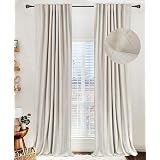
The preferred approach involves hanging curtains both high and wide. Ideally, curtains should be positioned closer to the ceiling than to the top of the window frame, typically extending approximately two-thirds of the way between the window and ceiling. Furthermore, they should extend past the window on either side, an arrangement that visually elongates the wall and enhances the perception of height within the room. In terms of width, panels that measure 1.5 to 2 times the width of the window are recommended. This generous fullness allows curtains to achieve soft, beautiful folds rather than appearing stretched and flat. The curtain drop should also be carefully considered, opting for styles that are either off the floor, precisely touching the floor, or elegantly draping onto the floor. Awkwardly hovering or unintentionally pulling curtains should be avoided to ensure a polished appearance. While custom curtains are often advocated for their superior fit and finish, a full look can be achieved on a budget by purchasing extra ready-made panels for added fullness, utilizing clip rings for height adjustment, and employing hem tape for length modifications without sewing. For windows with deep sills or radiators, Roman shades or sill-length curtains can be excellent alternatives. Considered window treatments significantly contribute to a room’s finished and elevated feel.
Embracing Material Honesty and Varied Texture
The incorporation of poor faux finishes is another element that can detract from a home’s aesthetic value. This refers to materials like artificial marble that appears overtly printed or vinyl flooring with exaggerated, unrealistic grain patterns. The issue does not lie in the material not being real stone or solid wood, but rather in its overt and unsuccessful attempt to mimic genuine materials. Authentic materials exhibit subtle variations, depth, and inherent imperfections, whereas low-quality faux finishes often present as excessively uniform or flat. The human brain is adept at discerning these discrepancies, which can lead to a sense of artificiality. When selecting laminate or porcelain, opting for more restrained patterns is advisable, as these are typically easier to imitate convincingly and will not inadvertently draw negative attention.
For timber elements, wood veneer can present a viable and often more affordable alternative to solid wood. Veneers feature a real wood layer on the surface, thereby providing genuine texture and grain. Similarly, engineered wood flooring, which utilizes a real hardwood top layer bonded over a stable core, offers the aesthetic and tactile qualities of timber without the premium cost of full solid planks. Beyond the authenticity of individual materials, the variation in texture throughout a space is equally important. Layering materials with distinct tactility, such as linen, wool, ceramics, stone, and wood with visible grain, enriches a room. For a refined or formal aesthetic, smoother textures like marble, velvet, or glass are suitable. Conversely, rougher textures such as linen, rattan, wool, clay, or raw timber can create a warmer, more casual, and inviting atmosphere. If a room feels texturally deficient, a simple starting point involves introducing one genuine material, such as a stone tray, a timber side table, a ceramic lamp, or even a living plant.
Upgrading Beyond Builder-Grade Everywhere
Many homes are initially equipped with standard “builder-grade” fixtures and finishes, such as recessed ceiling lights, ubiquitous “boob lights,” basic bathroom mirrors, and generic matte black knobs and handles. These selections are typically made to minimize construction costs and simplify the building process, but they often result in a home that feels generic and lacking in character. Addressing these elements is a fundamental step in elevating a space. Lighting, in particular, offers an immediate opportunity for enhancement. Relying solely on overhead ceiling lights leads to uniform, unflattering illumination, causing a room to appear flat due to the absence of depth and dimension. The preferred strategy involves layering multiple light sources to cultivate ambiance and atmosphere.
Incorporating floor lamps, table lamps, wall sconces, and pendants helps to create varied pools of light, adding warmth and visual interest. It is suggested to aim for three to five distinct light sources in each room, or at least enough to navigate comfortably at night without needing to activate overhead fixtures. Swapping out a generic “boob light” for a well-proportioned semi-flush mount is a quick and impactful upgrade. Beyond lighting, hardware offers another accessible avenue for improvement; exchanging basic knobs and handles for options with greater presence can instantly transform the feel of cabinetry. This seemingly small detail significantly contributes to the daily tactile and visual experience of a home. Furthermore, the selection of wall color plays a crucial role. A fresh coat of paint, properly sampled within the room’s specific lighting conditions, can fundamentally shift the entire atmosphere of a space. Moving away from default builder-grade selections and making intentional choices helps a home to transition from feeling generic to feeling truly personalized and yours.
Minimizing Visual Noise and Neglect: Taming Exposed Cords and Clutter
If a single factor could be identified as most indicative of an uncared-for home, it would undoubtedly be visible cords and pervasive clutter. The transformative impact of addressing these two elements on a room’s overall aesthetic and perceived quality is remarkable. Visual noise, in the form of exposed cables and scattered objects, stands as a primary adversary to effective interior aesthetics. These elements invariably draw unwanted attention, distracting from any inherent beauty in a room. Regardless of the sophistication of its design, prominent cables and disorder detract significantly from a space’s curated appeal.
Effective cable management involves creative concealment, such as hiding cords behind furniture, utilizing cable boxes, or mounting cable trays beneath desks to consolidate wires. When cables must traverse the floor, employing covers that blend seamlessly with walls or flooring helps to minimize their visual impact. Attention should also be directed to surface styling. Instead of scattering numerous small objects across a dining table, grouping them on a tray transforms them into a single, intentional arrangement rather than a collection of disparate items. Everyday essentials should be contained within drawers or decorative bowls, ensuring that every item has a designated home. The act of decluttering is among the most cost-effective enhancements one can undertake; it not only creates a sense of calm but also inherently elevates the appearance of existing possessions. A room that feels serene and orderly, rather than chaotic, instantly conveys a heightened sense of refinement.
Establishing a “Red Thread”: Ensuring Rooms Connect
Sometimes, a home may appear to lack polish not due to individual poor choices, but because the various elements within and between rooms fail to relate cohesively. This can manifest as the use of disparate color schemes in every space, an illogical mix of metal finishes, or clashing wood tones from one room to the next, creating a disjointed and random impression. The element that unites a space, lending it a sense of continuity, is often termed a “red thread.” This does not necessitate complete uniformity, but rather a deliberate repetition of certain elements. This could involve a consistent metal finish, a recurring wood tone, or a specific color family that appears throughout the dwelling.
As a simple guiding principle, repeating an element at least twice within a room is recommended. For example, if a walnut coffee table is introduced, its presence could be echoed by a walnut picture frame, a decorative tray, or another piece of furniture featuring the same wood. Similarly, if brass is used in a lamp, its finish might be reiterated in hardware or a mirror frame. If a rug incorporates warm rust tones, these could be picked up again in a cushion or piece of artwork. While mixing metals, woods, or colors is certainly permissible, ensuring that each choice has a “friend” within the space fosters repetition and rhythm, which in turn makes a room feel intentional and thoughtfully designed. This concept extends across the entire home; while individual rooms may exhibit bolder or more unique styles, a subtle connecting thread, such as a consistent wood tone, a deeper shade of a shared color family, or a cohesive architectural language, ensures overall harmony. This underlying connection is what allows a home to feel cohesive and welcoming, rather than merely pieced together.
Thoughtful Application of Accent Walls: Avoiding Common Pitfalls
Accent walls frequently fail to achieve their intended effect, often appearing cheap due to fundamental misapplications. Two prevalent mistakes are commonly observed. The first is characterized as the “lonely wall,” where a single wall is painted a bold color or adorned with paneling without any architectural feature or decor to anchor it. This draws undue attention to a wall that lacks a focal point, effectively highlighting a meaningless surface. The second common error is the “half-committed feature,” in which paneling or slats only partially cover a wall. Such incomplete applications do not properly frame an area and convey a sense of hesitation rather than intentional design, leading to an unbalanced and unfinished appearance.
For accent walls to be successful, they must be purposeful and fully committed. One effective approach is to embrace the chosen color, wallpaper, or pattern across the entire room, rather than isolating it on a single wall. If a wall is designated as an accent, it must inherently support a focal point, such as a bed headwall, or a wall serving as a backdrop for a credenza and mirror. When incorporating paneling or slats, it is crucial that these elements integrate seamlessly with the home’s architecture and extend fully from edge to edge, creating a built-in rather than an afterthought appearance. It is important to recognize that an accent wall is often introduced to combat a room’s perceived flatness. However, a more effective strategy for cultivating visual interest involves implementing principles such as decorating vertically, layering varied textures, curating furniture and objects thoughtfully, and repeating color families and materials with diverse applications. By establishing these foundational home design elements, a room often develops sufficient character and depth, rendering the need for a compensatory accent wall obsolete.
Uncheapening Your Home: Your Design Questions Answered
How can I make a room feel taller and more balanced?
Focus on the upper parts of your room, not just the lower half. Hang artwork higher, use tall floor lamps, or install curtains closer to the ceiling to draw the eye upwards.
Is it okay to buy all my furniture from the same matching set?
It’s best to mix furniture from different places to avoid a ‘showroom’ look. Try to limit matching pieces from the same product line to no more than two per room.
How can I make my decor feel more personal and less generic?
Choose artwork that has personal meaning or brings you joy, rather than mass-produced prints. Opt for real plants or very natural-looking faux plants to add authenticity.
What’s a simple way to make my home look more organized and cared for?
Hide exposed cords behind furniture or using cable covers. Also, declutter surfaces and group small items on trays to reduce visual clutter.
What’s the best way to hang curtains to improve my room’s look?
Hang curtains high and wide, closer to the ceiling and extending beyond the window frame. This makes your windows and room appear taller and more spacious.